Weg
Designed by Carolina Giovagnoli
Release date: 2022
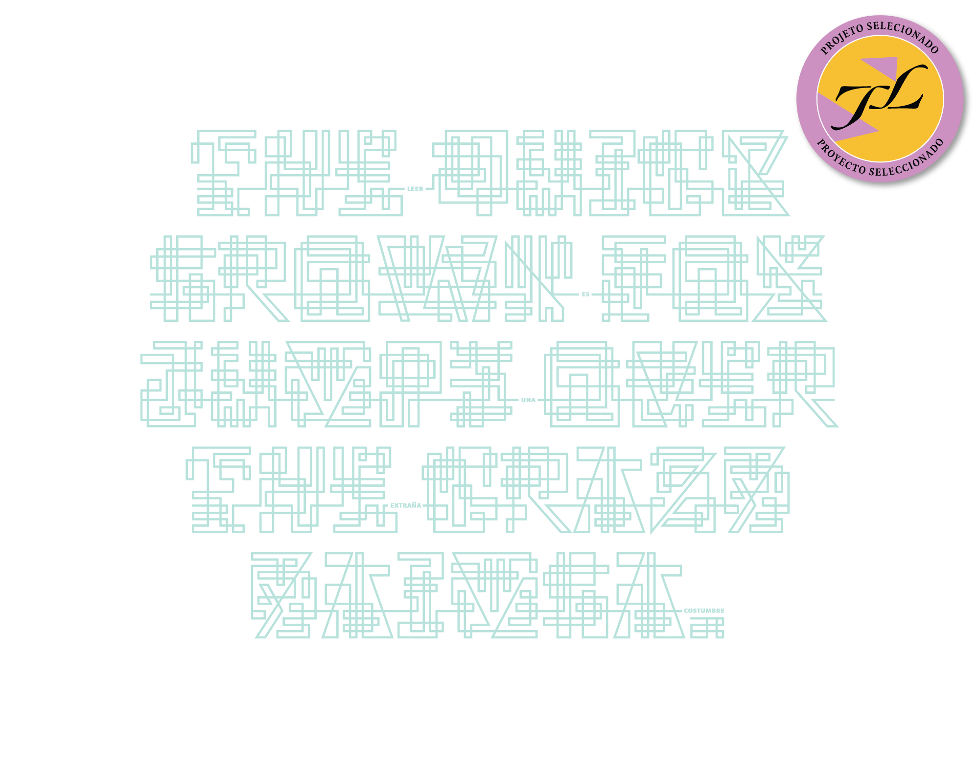
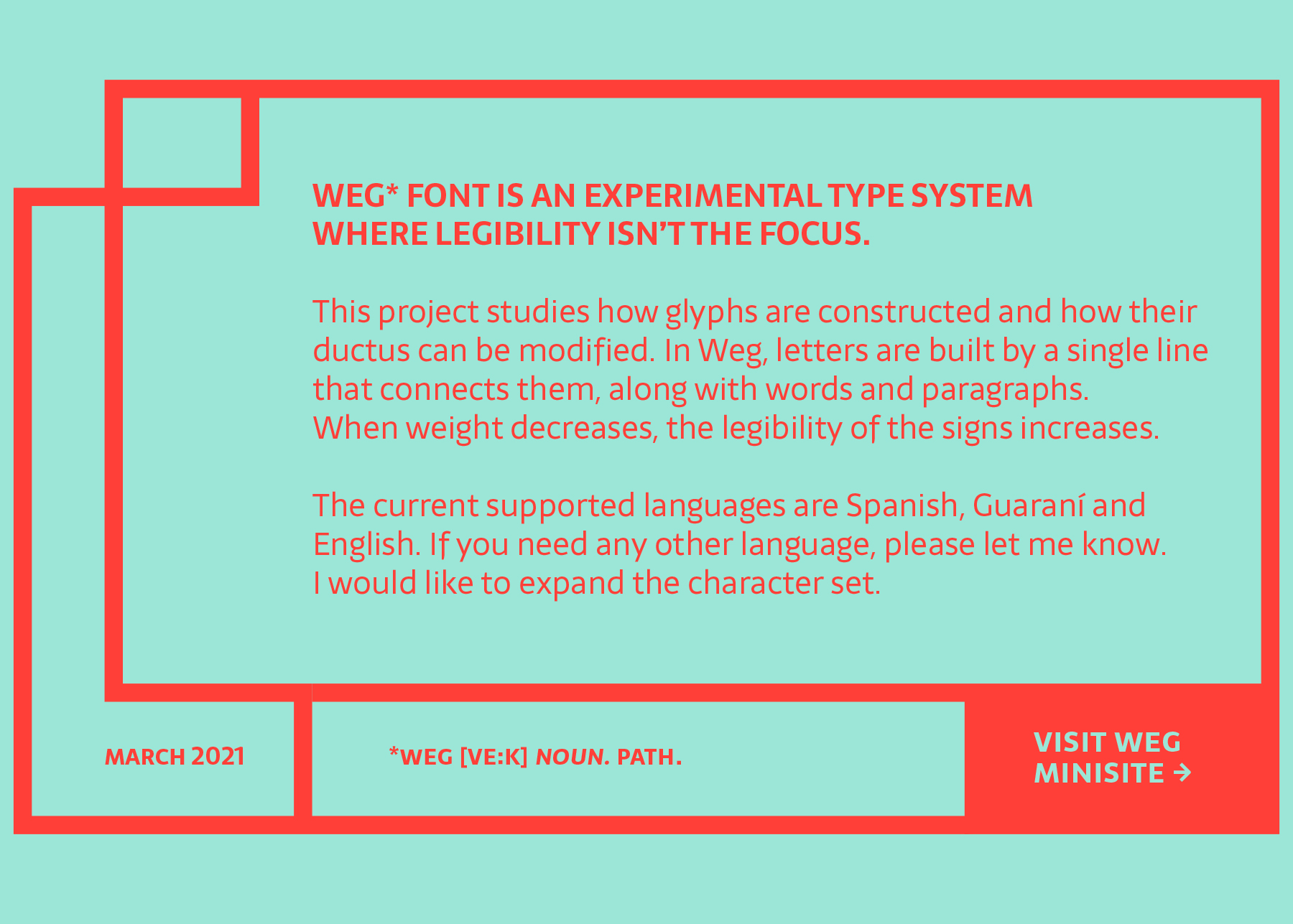
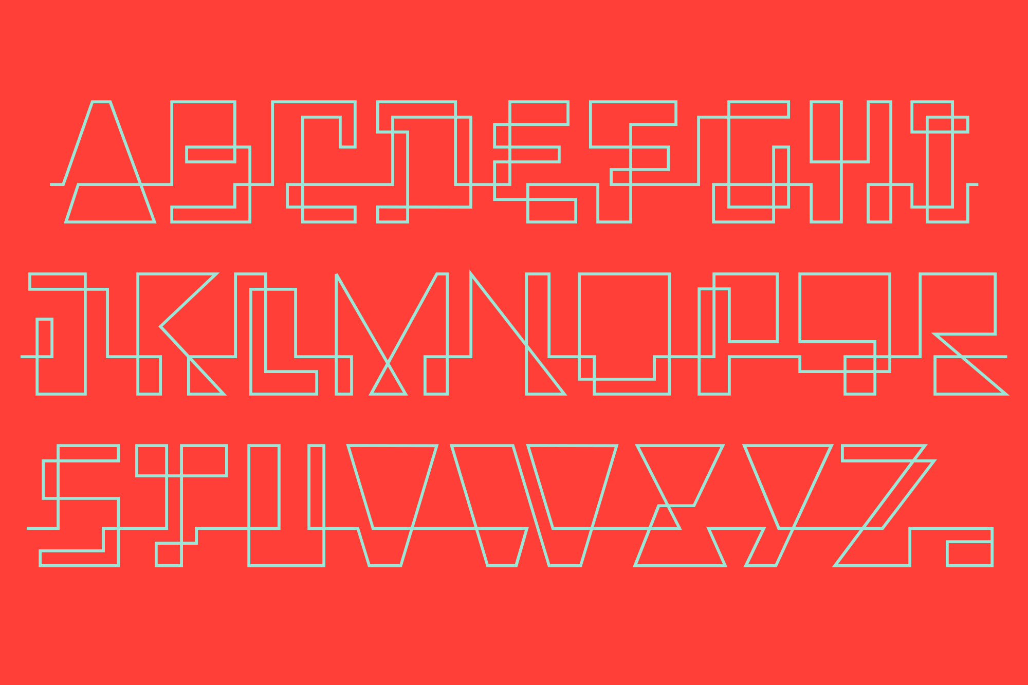
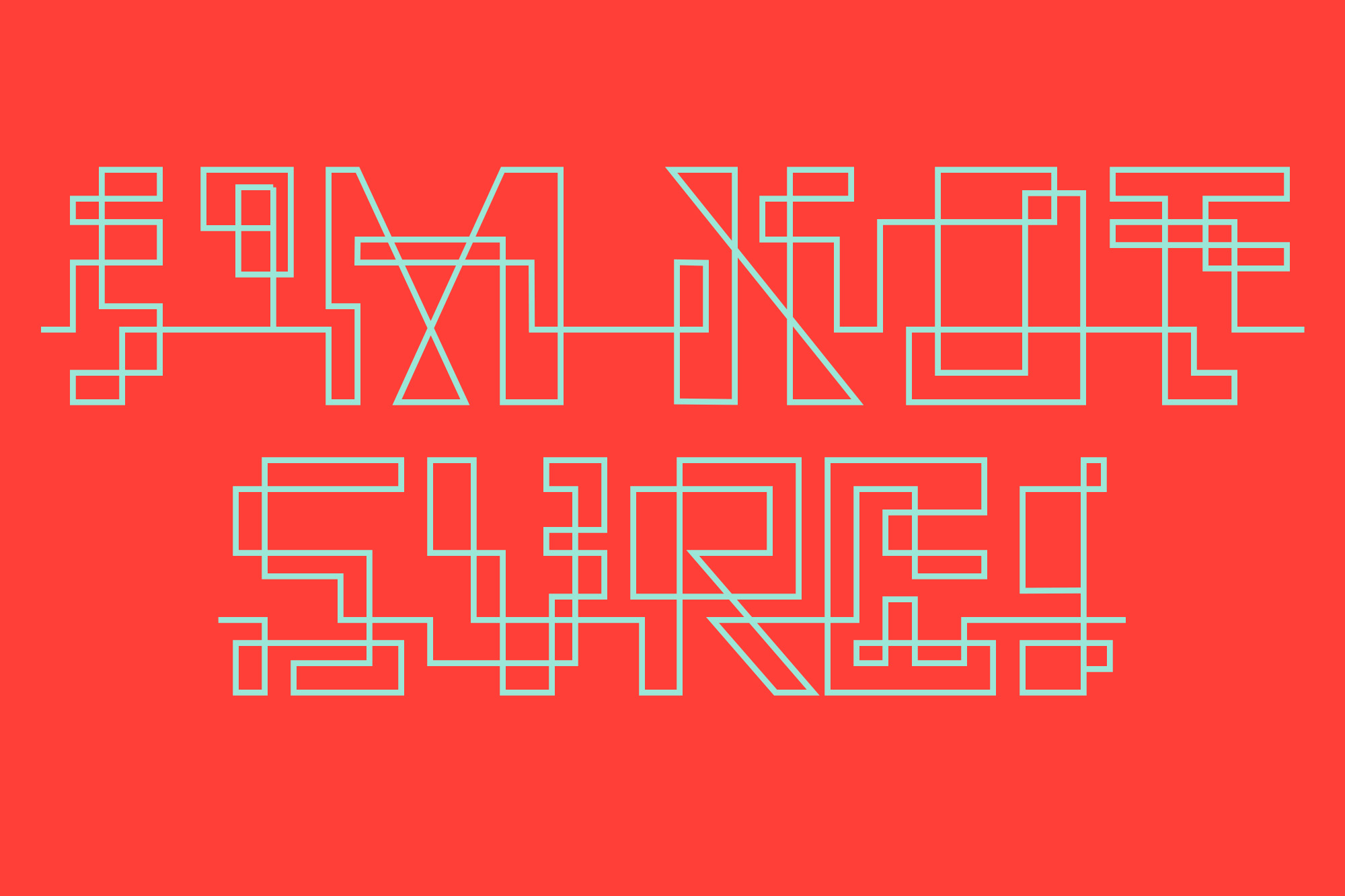
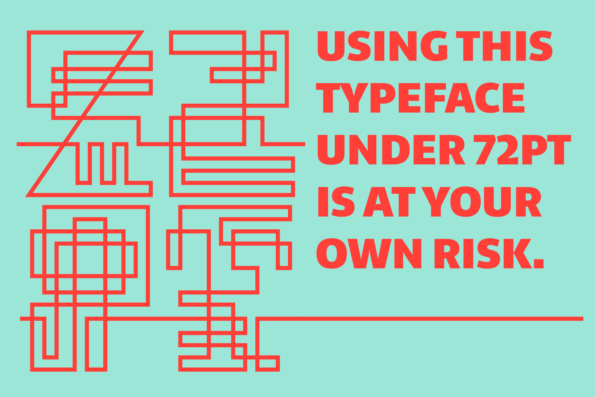
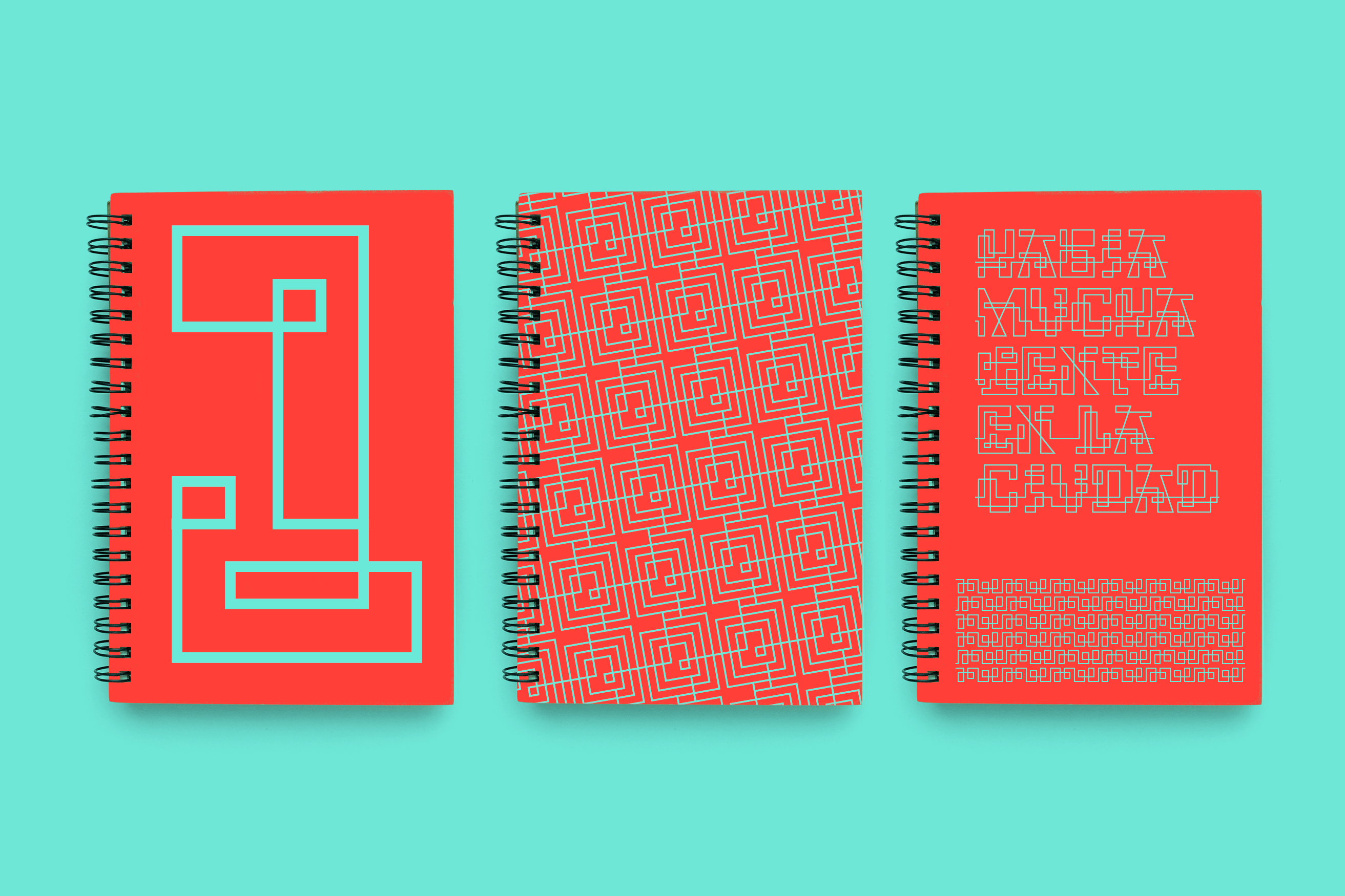
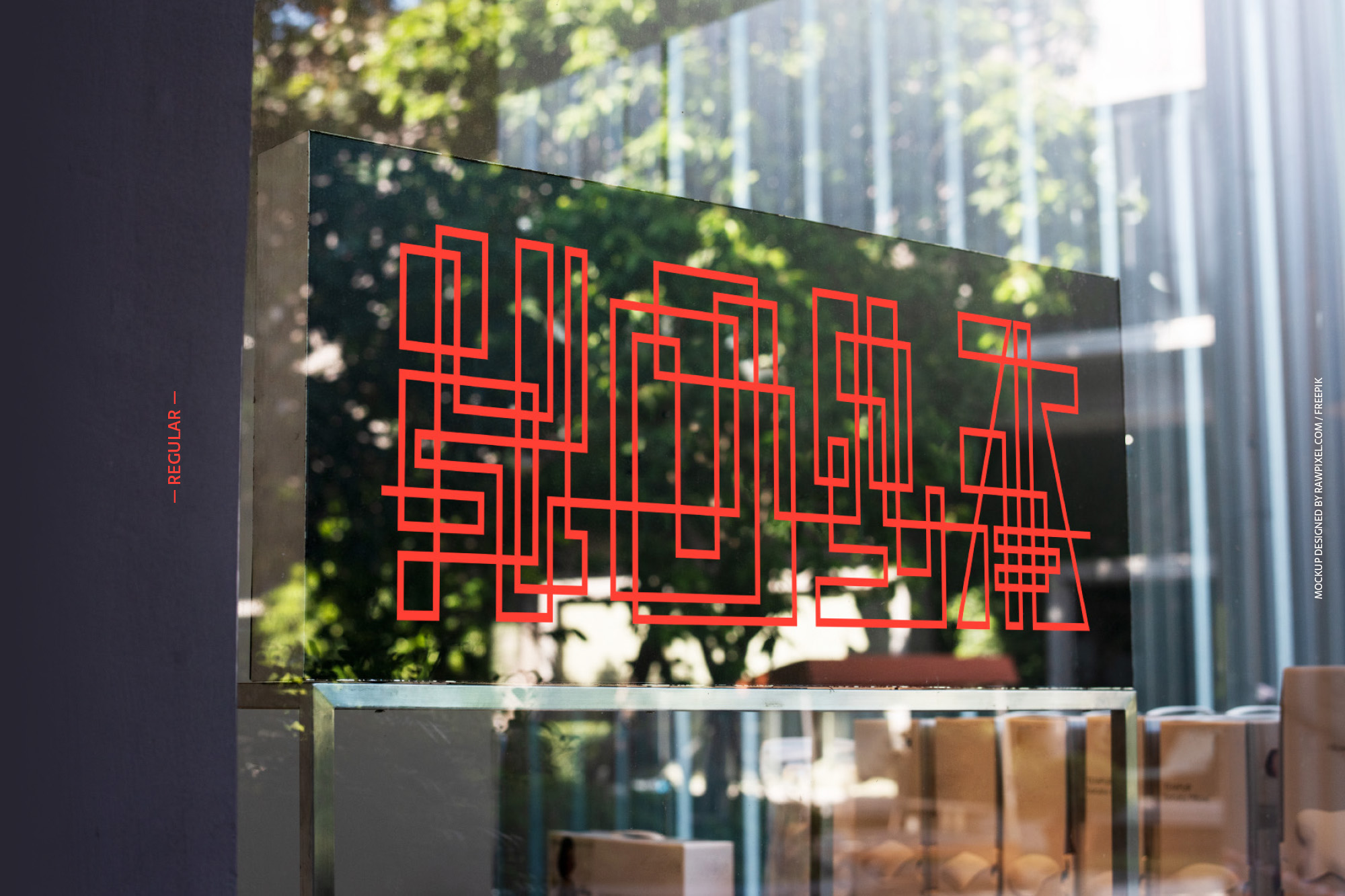
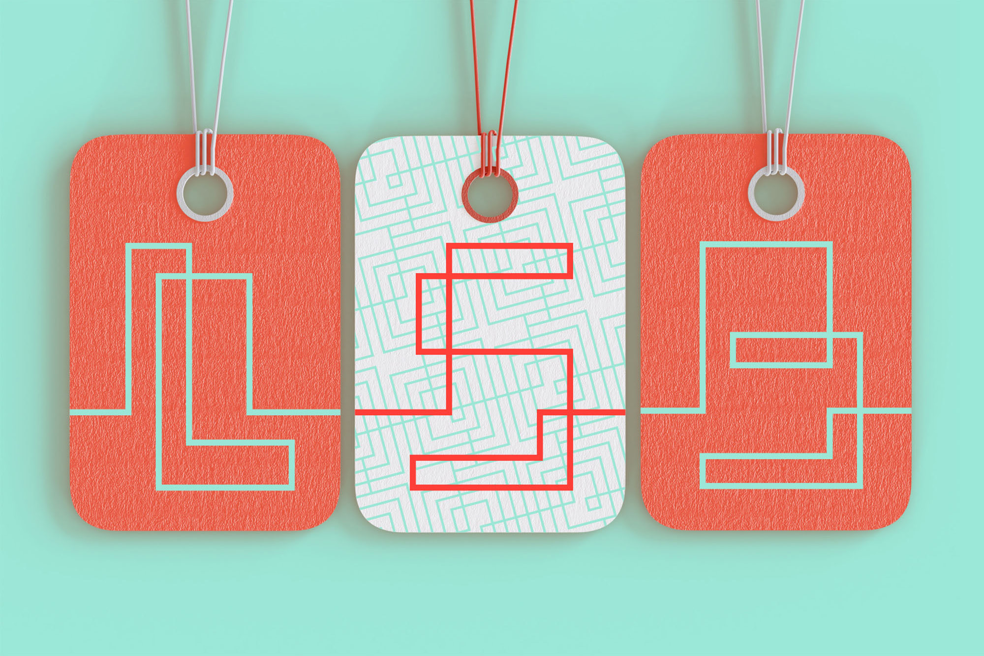
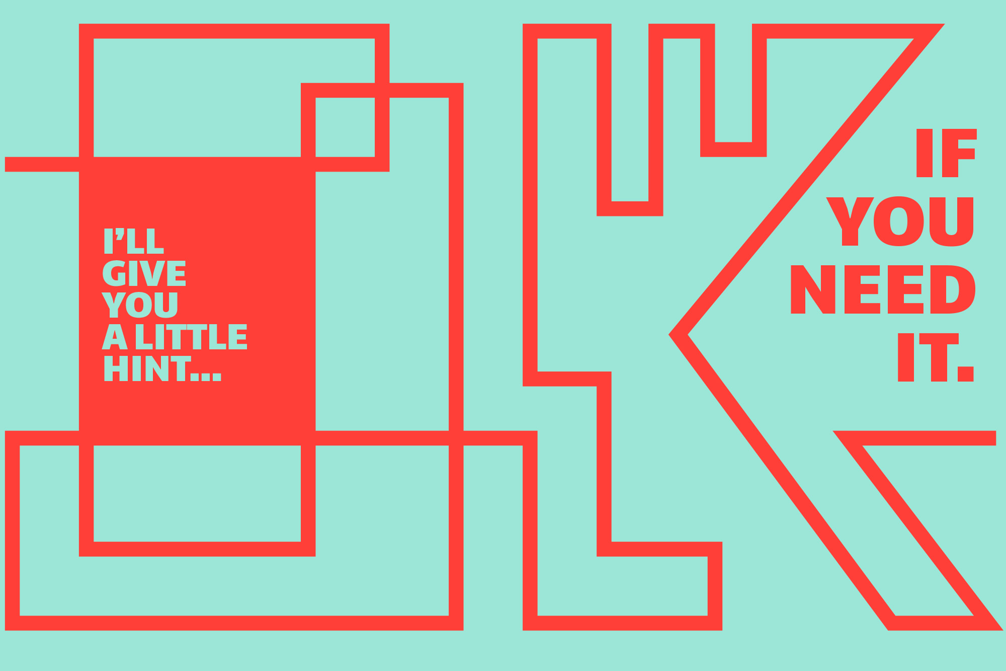
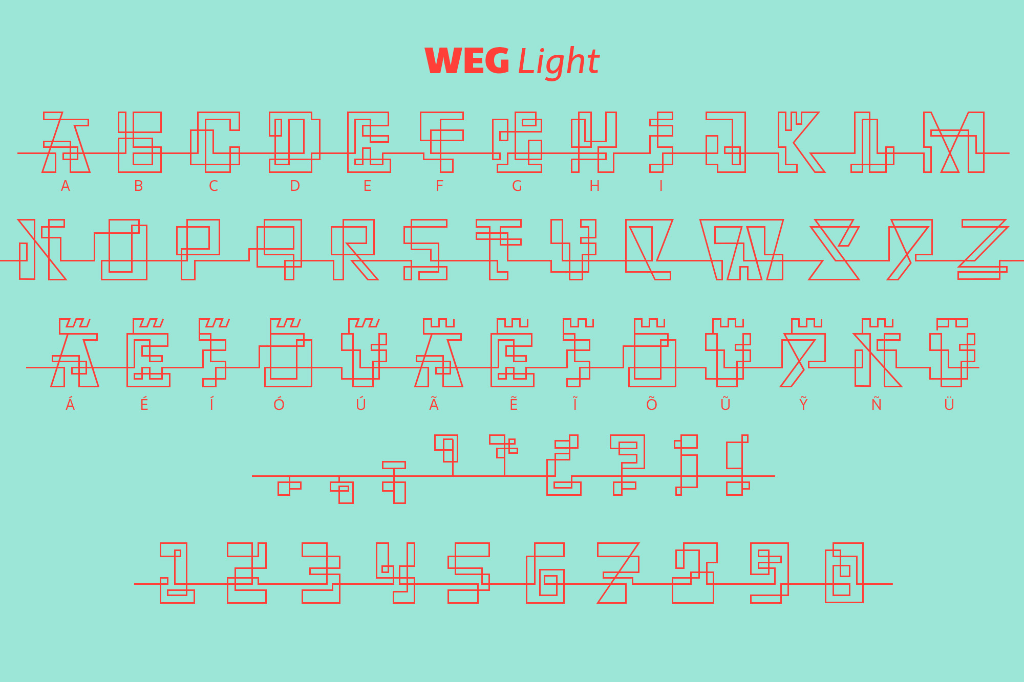
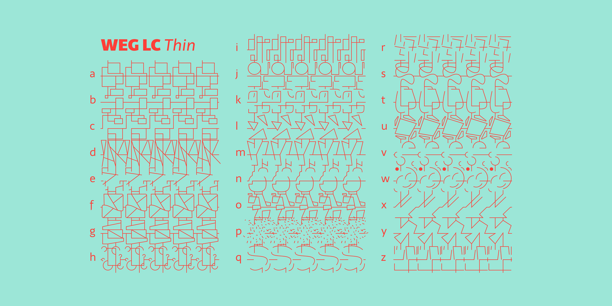
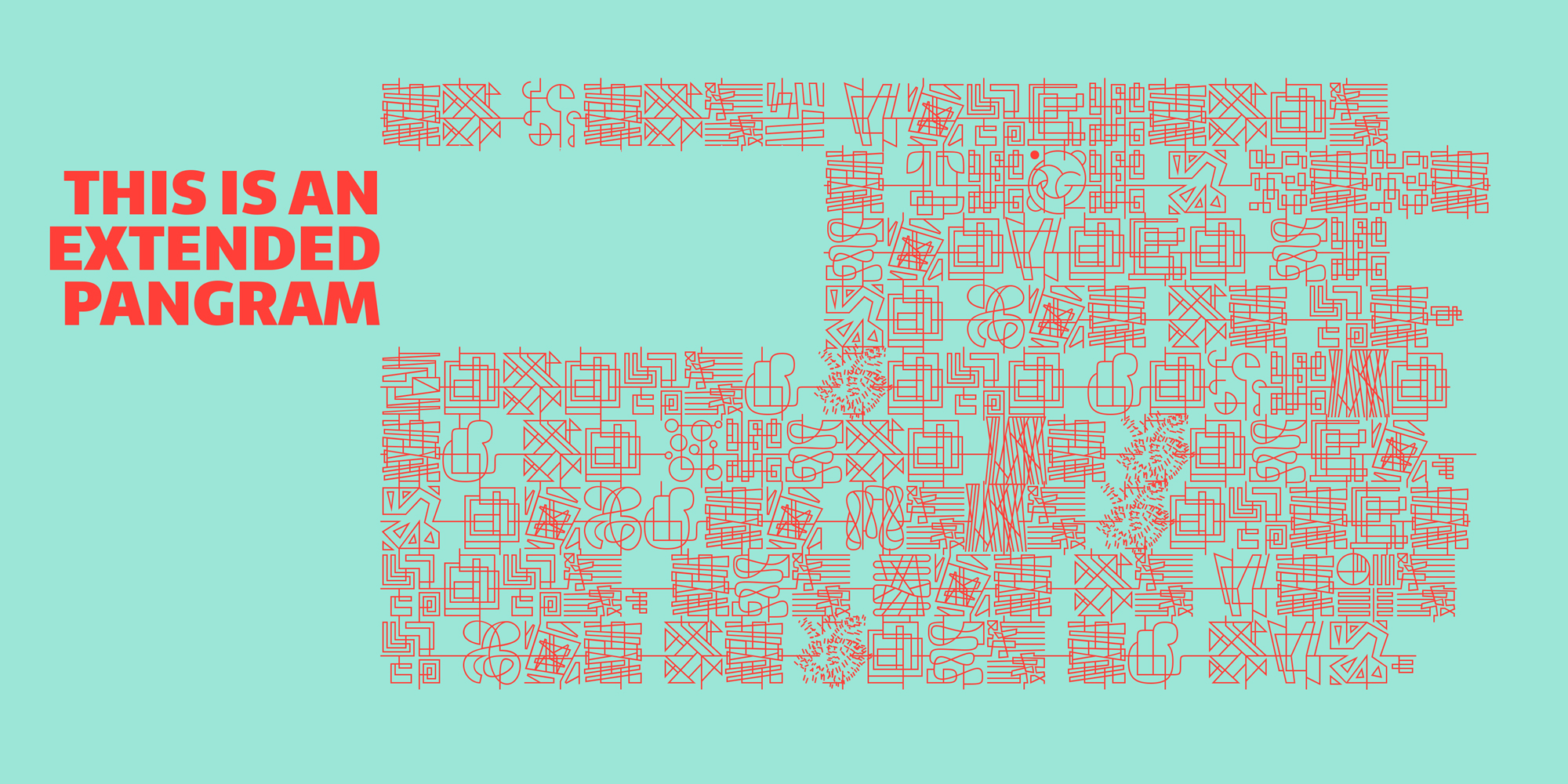
WEG* font is an experimental type system where legibility isn’t the focus.
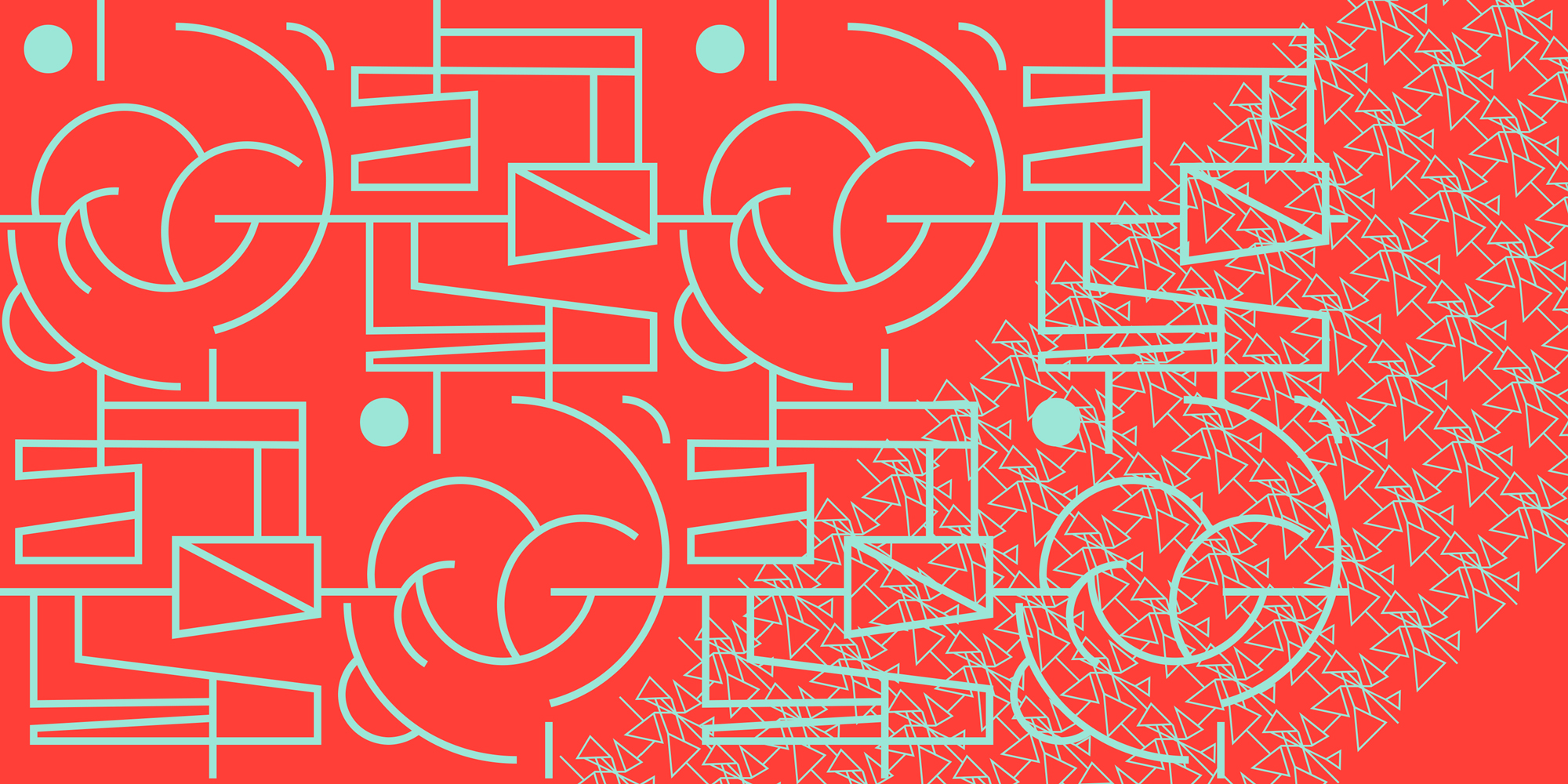
This project studies how glyphs are constructed and how their ductus can be modified.
I explored how far I can move the limits if I don’t worry about the legibility.
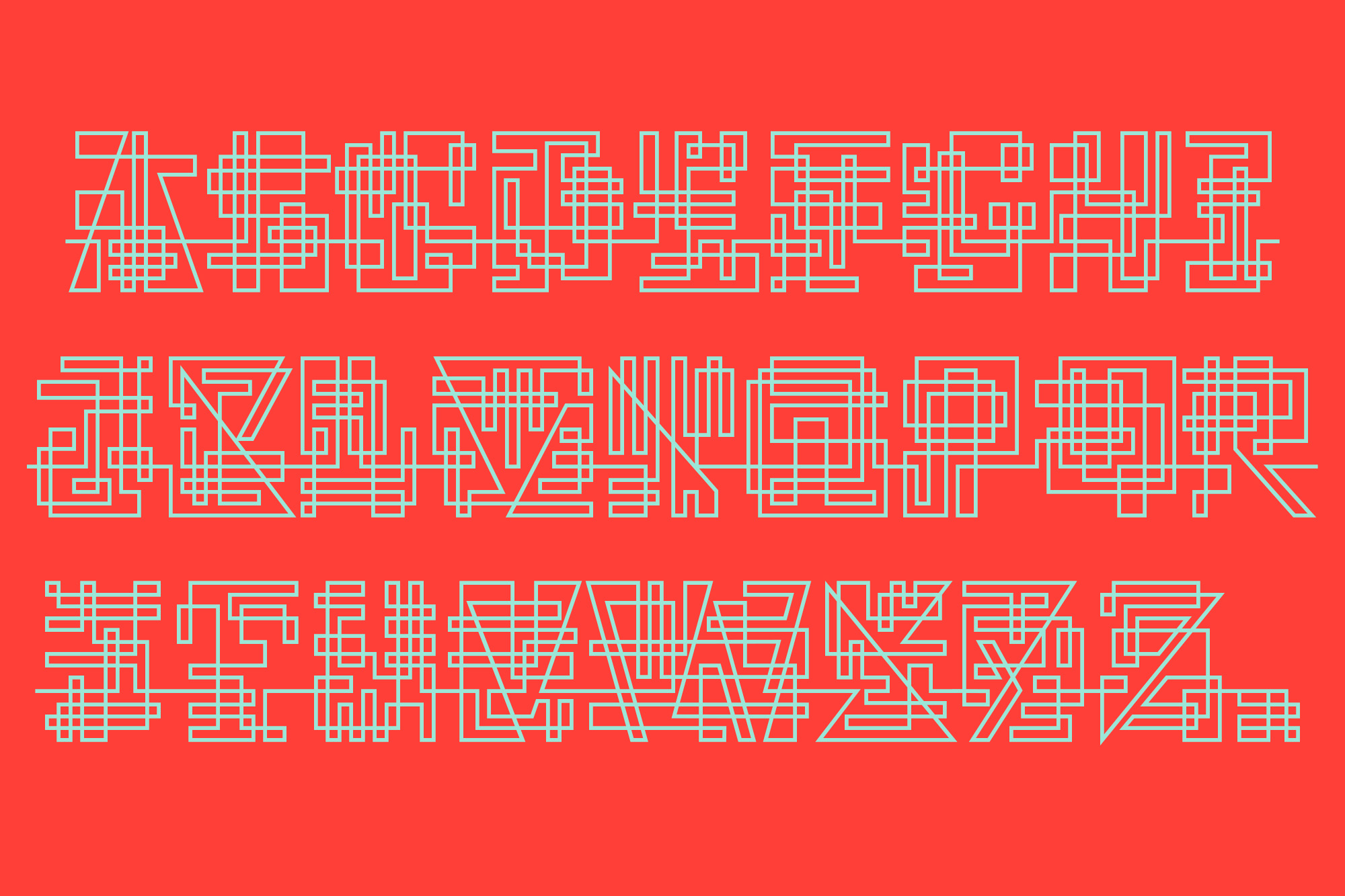
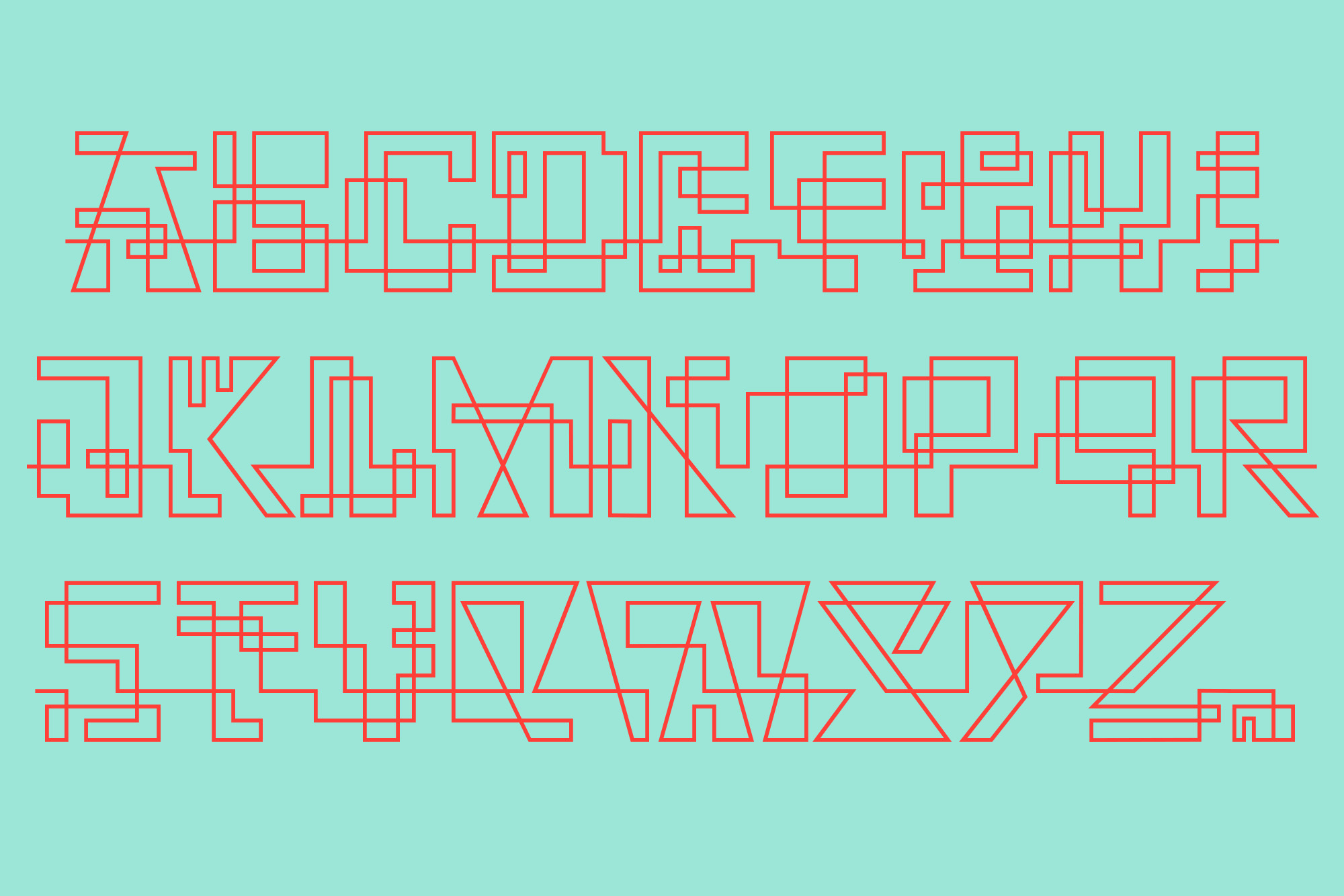
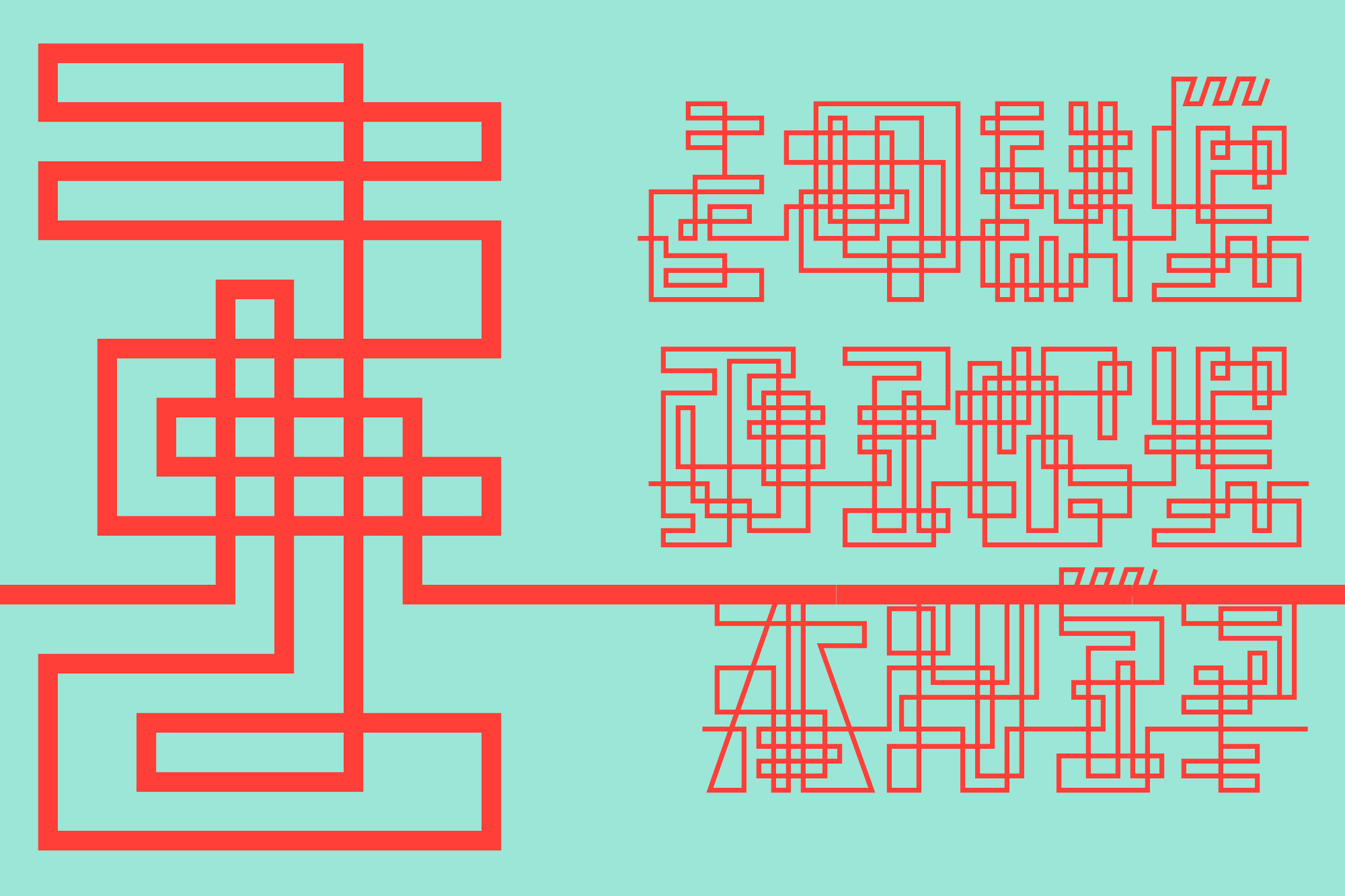
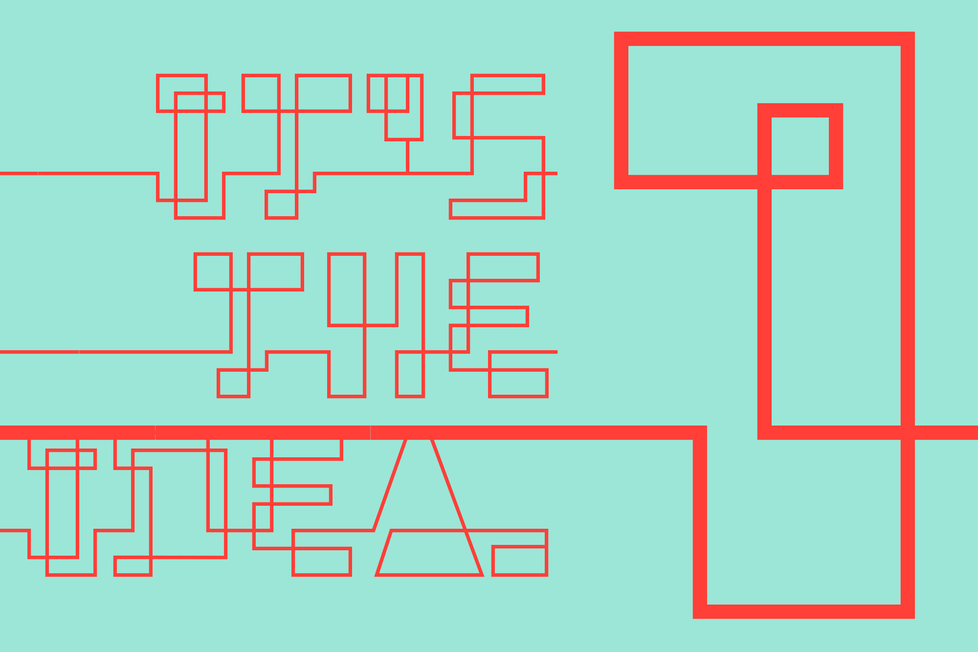
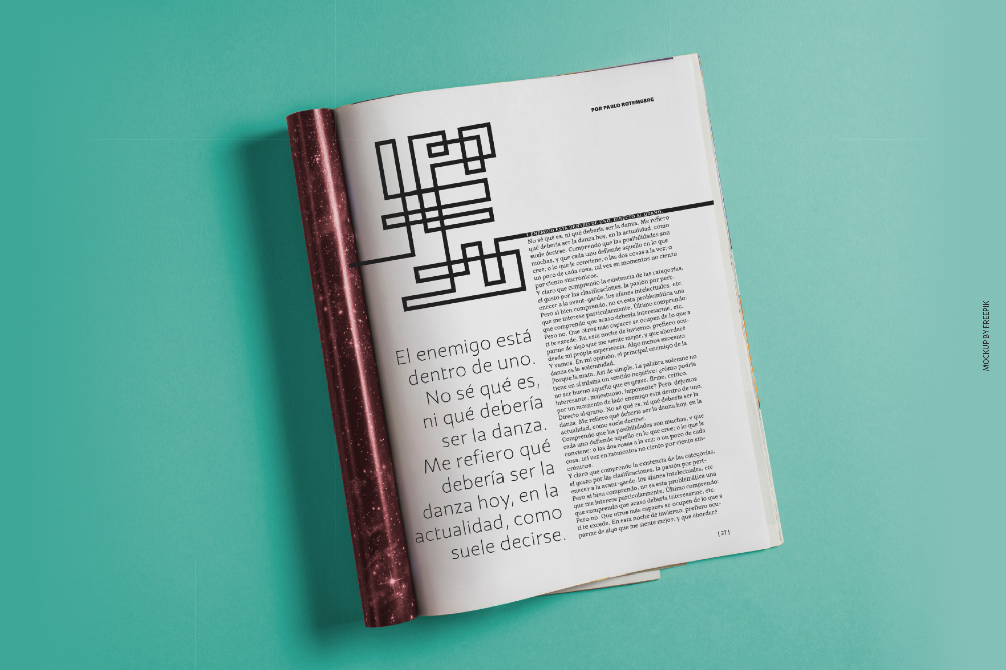
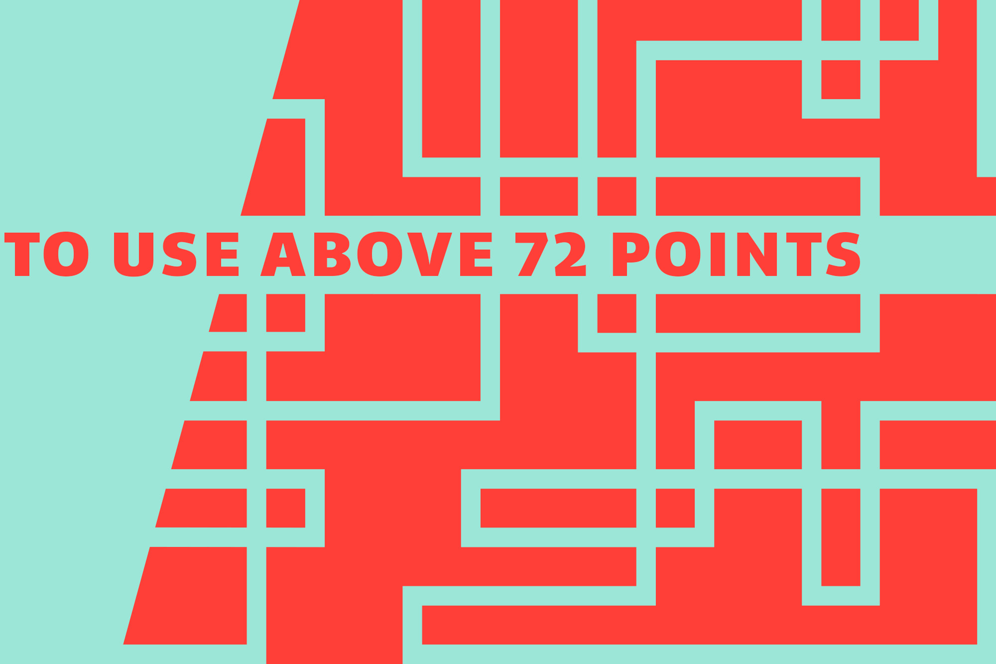
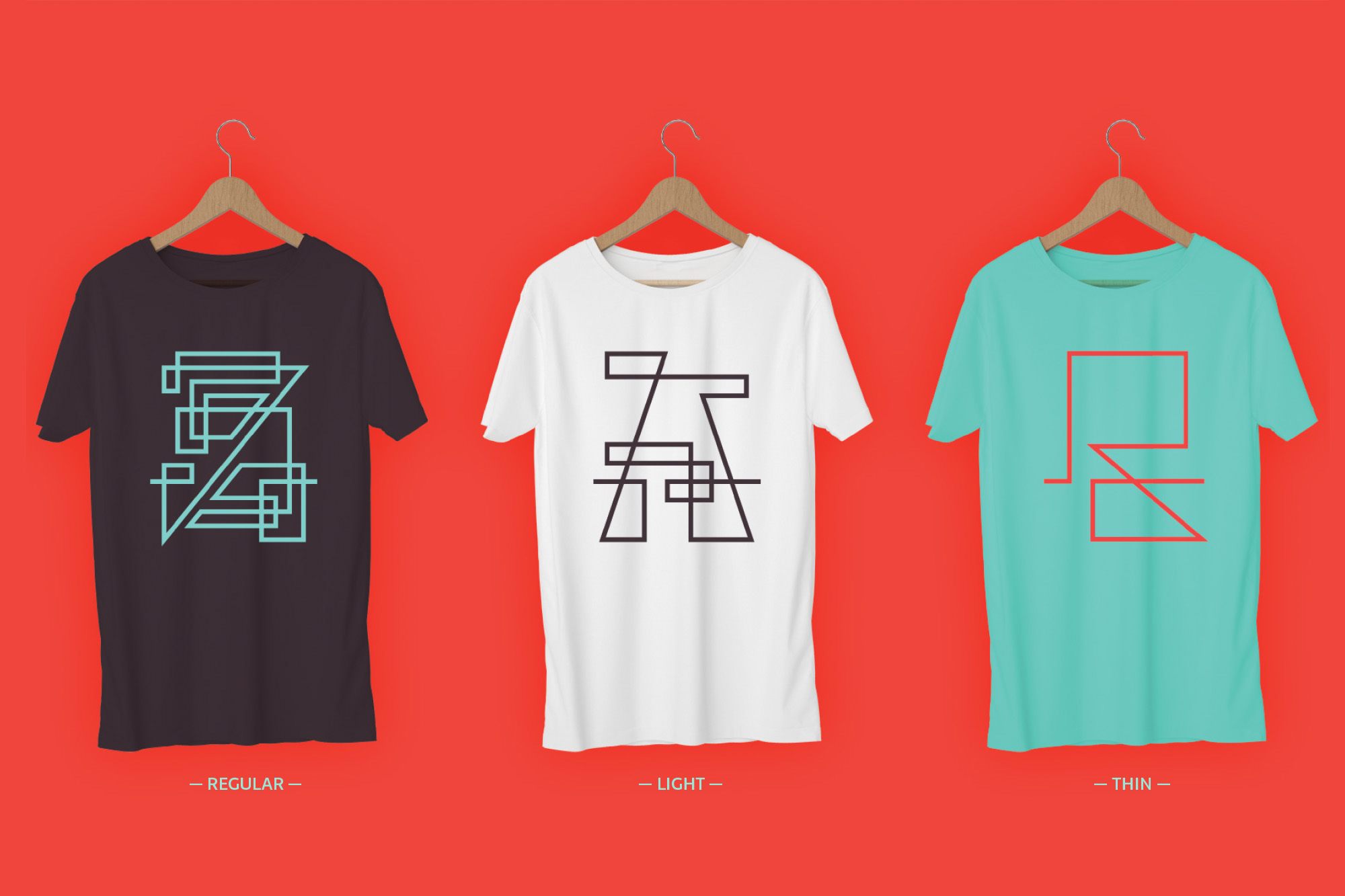
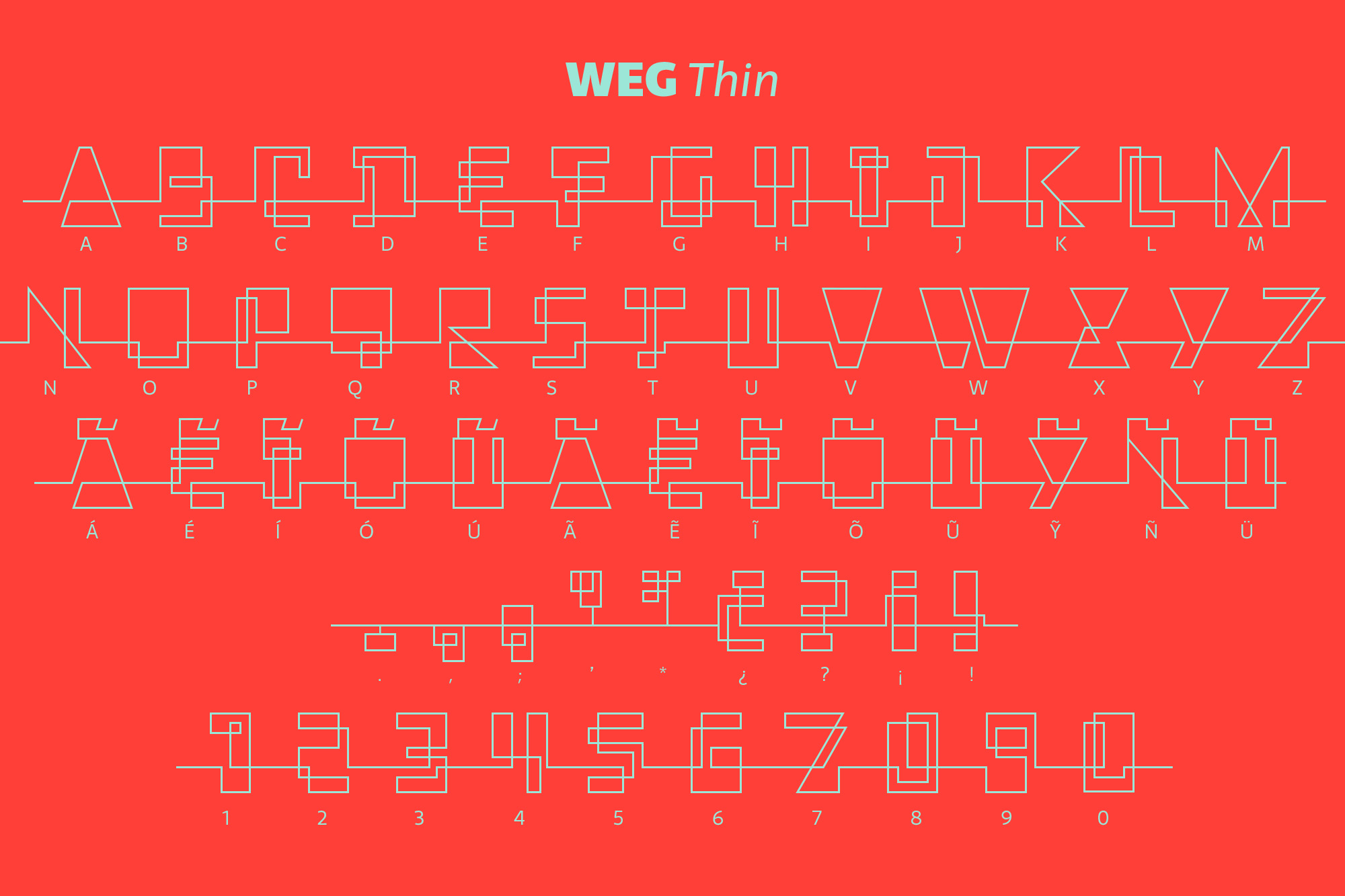
In Weg, letters are built by a single line that connects them, along with words and paragraphs. When weight decreases, the legibility of the signs increases.
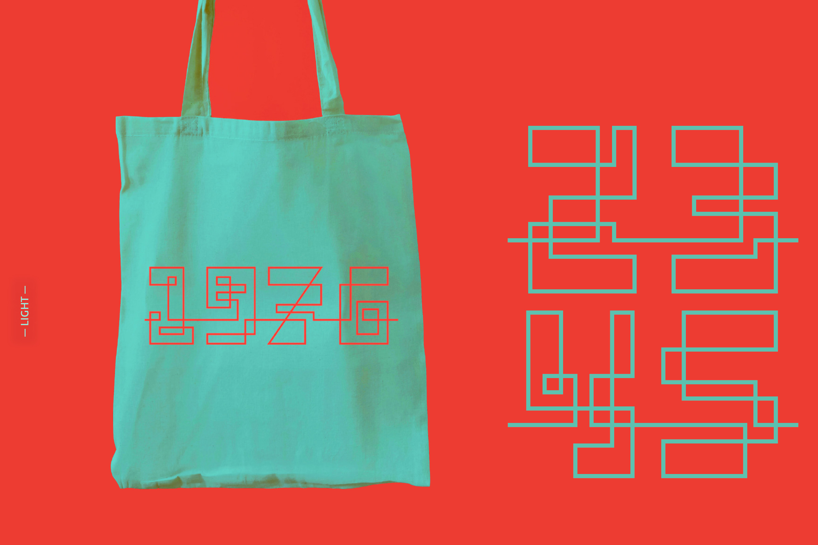
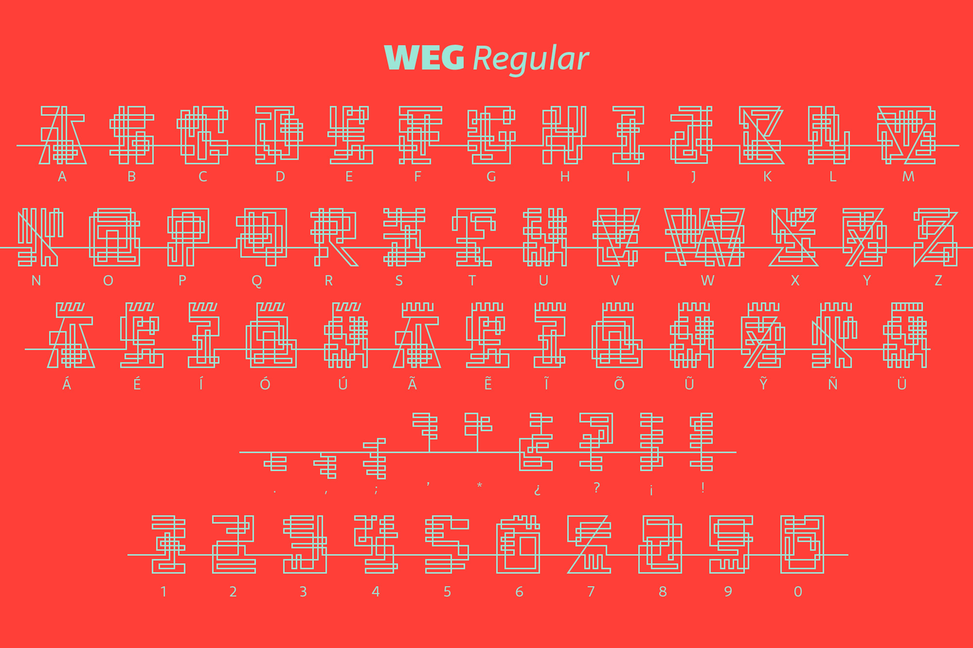
The uppercase set contains, lining figures and basic punctuation in three weights: Regular, Light and Thin.
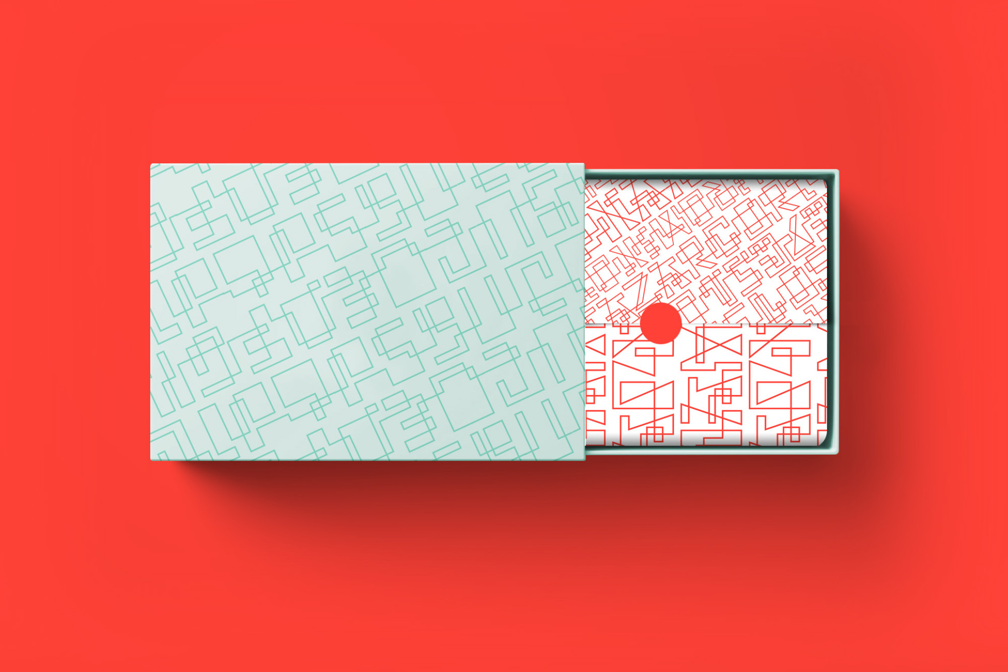
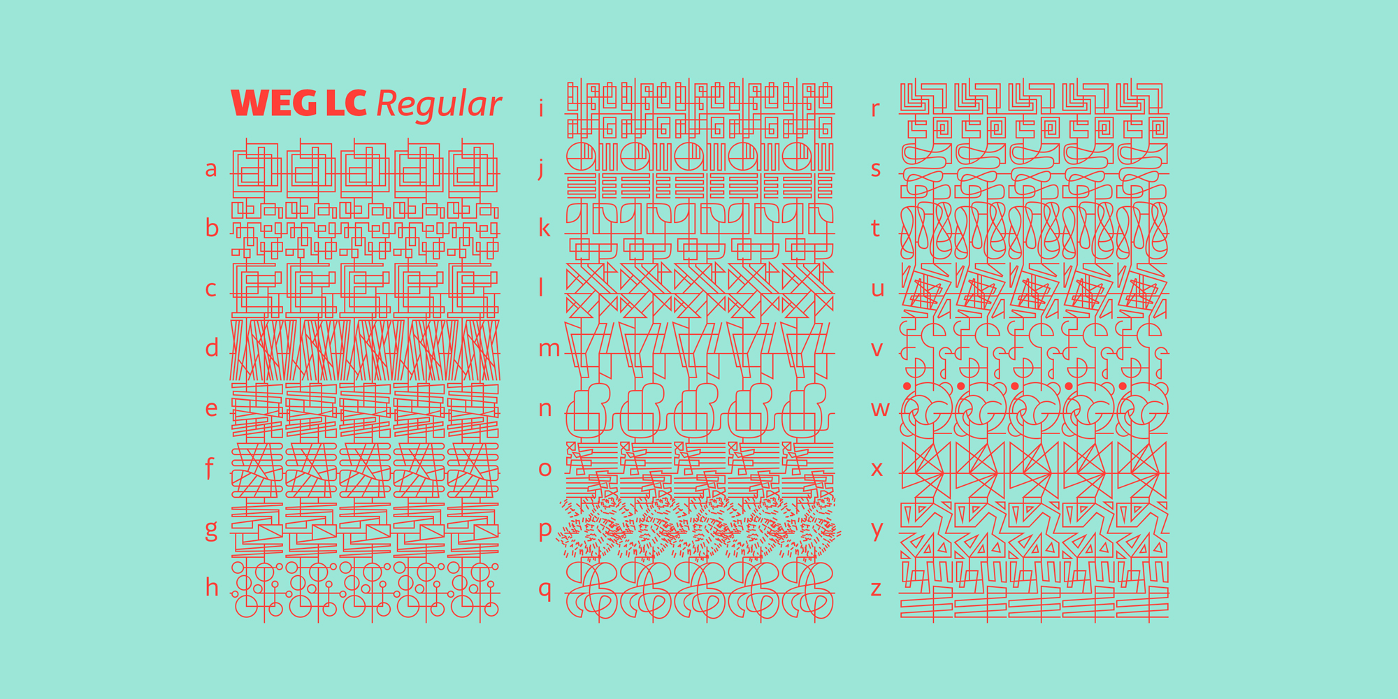
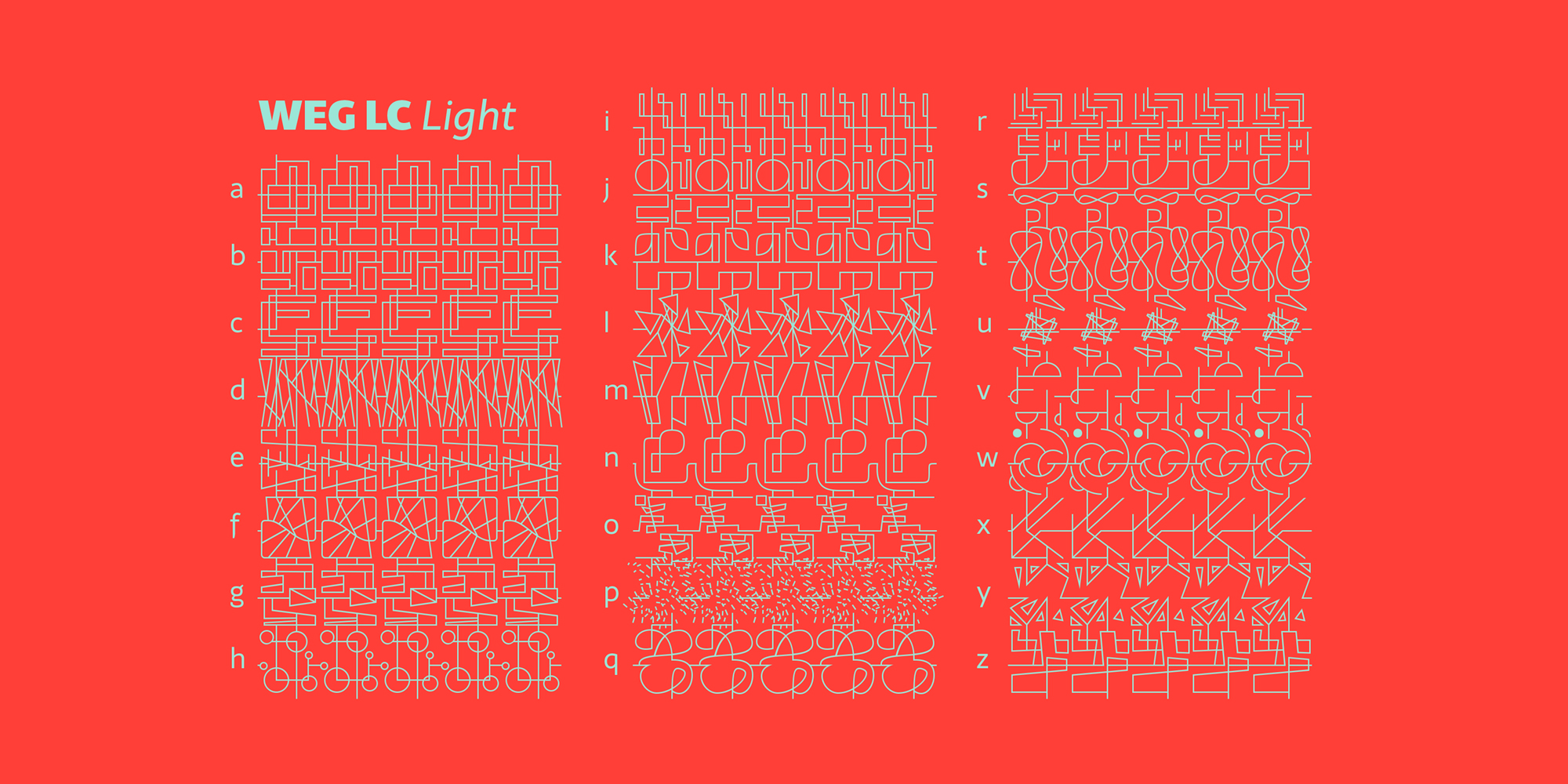
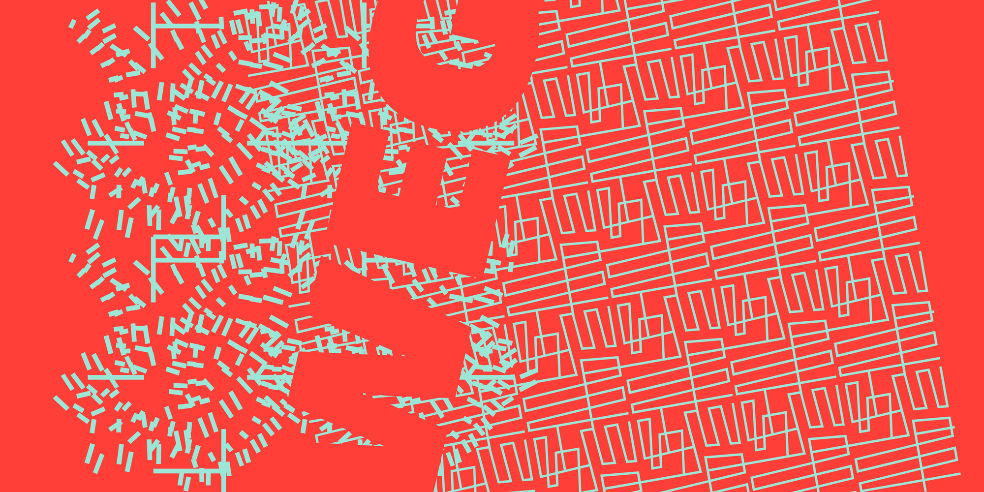
The lowercases are a set of typographical patterns in three weights all connected and combinable.
The current supported languages are Spanish, Guaraní and English. If you need any other language, please let me know. I would like to expand the character set.
(If you're looking for a font to use in a project where legibility is important, I suggest you to pick Telder ht, Alegreya ht, Andada ht, Cira ht, Piazzolla or any other type from our catalogue.)
 Secure checkout with PayPal. For other ways to pay please contact us.